Ken Garland Zine Mockup | Project Details & Breakdown
Designer Research
Sourced Text
Garland was born in Southampton, and he grew up in Barnstaple, north Devon. In 1945, he enrolled at the Royal West of England Academy in Bristol and served in the Parachute Regiment after graduation where he was sent to Lübeck, Germany in 1948. He later studied design at London’s Central School of Arts and Crafts, graduating in 1954. His classmates included Derek Birdsall, Alan Fletcher, Colin Forbes, Peter Wildbur and Philip Thompson. That same year, he married Wanda Wistrich. After graduation, Garland became the art editor of Furnishings magazine. In 1956, he became art editor of Design magazine, the trade journal of the Society of Industrial Arts, until 1962. This period was a foundational for Garland’s future work and was commissioned to go to Switzerland to survey Swiss graphic design. In 1962, he left Design to form his own studio, Ken Garland & Associates. Garland was politically active throughout his career, notably as a member of the Campaign for Nuclear Disarmament. Garland produced material for the CND from 1962–68. It was during this time that he redrew the peace sign to the simplified, bold graphic widely used today. Garland taught throughout his career at the Central School of Art and Design (1986–91), University of Reading (1971-99), Royal College of Art (1977–87) and University of Brighton, among other institutions. Garland was a prolific writer. His work has been published in Baseline, Blueprint, Creative Review and Eye magazine. He is the author of five books on design, including Graphics Handbook (1966), Illustrated Graphics Glossary (1980), Mr Beck’s Underground map (1994) and A word in your eye (1996). In 2008, Garland founded Pudkin Books with his wife, artist Wanda Garland (Wistrich). Pudkin is known for a series of picture books each on the theme of “A Close Look at...” a particular subject. He died on May 20, 2021 of cancer. His outlook was distilled in the manifesto he delivered at a meeting in 1963 of the Society of Industrial Artists (SIA). Sitting at the back of the hall and frustrated by the discussions taking place, he wrote out the first draft of what was published the following year as First Things First. The document called on designers to question their role in the new burgeoning consumer culture that was monopolising the profession: “We are proposing a reversal of priorities in favour of the more useful and more lasting forms of communication. We hope that our society will tire of gimmick merchants, status salesmen and hidden persuaders, and that the prior call on our skills will be for worthwhile purposes.” It was signed by a small band of like-minded practitioners – none from the big design groups of the period. First Things First came to the attention of the Labour politician Tony Benn, who as Anthony Wedgwood Benn was postmaster general in Harold Wilson’s first government. Benn reprinted the manifesto in a column in the Guardian, adding: “The responsibility for the waste of talent which they have denounced is one we must all share. The evidence for it is all around us in the ugliness with which we have to live. It could so easily be replaced if only we consciously decided as a community to engage some of the skill which now goes into the frills of an affluent society.”
Refrences of the Designers Work


Mindmaps to Brainstorm Concepts


Concept
Title & Font Exploration


Cover Thumbnails


Layout Thumbnails


Design
Digital Mock-up


Roughs


Grid Layout


Final Page Spreads


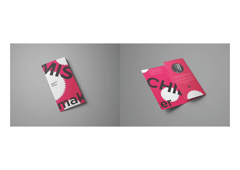
Print Mock-Ups

Final Rational
In doing the research for my designer Ken Garland. I was interested and inspired by not just his work with various brands but also his extensive history with activism, not just in the space of politics but also in the world of design. The idea for my brochure came from Garlands involvement in these brands that focused on children and would appeal to their playful nature. So to display this “playful” attitude a title and a main design were created to encapsulate this theme. Mischief Maker was a enjoyable title that would convey the lighthearted nature of Garland and his contributions to slightly more disruptive activities in the world of design, such as his manifesto “First Things First”. I particularly enjoyed the decisions to hide portions of the title in the fold of the brochure to also convey the playful attitude. I was pleased that in addition this obscured title that folded around the pages of the brochure would prompt the readers to unfold and discover what the text would be. I believe the most challenging parts were finalizing the composition of the brochure, and making sure that the content would fit appropriately into the grids and guides of the pages. I received very helpful feedback and managed to find the correct positions and placement of not just the text but also the images and other graphic elements to make certain parts of the brochure pop out, such as the pull quote.